Health & Service Cloud UX Transformation
Company: Salesforce
Problem
EmblemHealth was operating multiple siloed systems: provider onboarding, member support, credentialing, and care coordination lived in disconnected legacy platforms. The lack of integration led to slow provider enrollment, frustrated customer service agents, and disjointed member experiences.
Solution
We built an end-to-end Salesforce solution using Health Cloud, Service Cloud, Experience Cloud, and Marketing Cloud to unify EmblemHealth’s digital ecosystem. That included provider onboarding, member self-service, agent support, and personalized outreach.
-
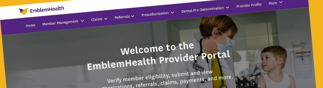
Provider Portal (Health Cloud / Experience Cloud): We designed a step-by-step onboarding experience to help providers join the EmblemHealth network with less friction. The portal includes embedded DocuSign for e-signatures, CAQH integration for credential checks, and real-time status updates. Providers can now apply, upload documents, and track their progress without back-and-forth emails. This brought the average credentialing time down from over 60 days to around 30.
-
Member (Service Cloud / Experience Cloud): We gave members a better way to manage their care online. The portal shows personalized plan details, care history, and secure messages in a clean, easy-to-use layout. Members can check benefits, submit support requests, and find what they need without calling in.
- Agent Console (Service Cloud) We built a custom Lightning console for agents that surfaces everything in one place: member profiles, care plans, open cases, and past interactions. Einstein handles smart case routing and helps surface the right context during calls. Fewer clicks and less digging means agents can resolve issues faster, boosting both member satisfaction and call center performance.
How We Got There
Stakeholder Workshops & Ecosystem Mapping
We kicked things off by getting everyone in the same (virtual) room: stakeholders, IT, customer support, provider relations, and operations. Using Miro, we facilitated a series of collaborative workshops to unpack how things were actually working across the board.
Together, we mapped out three core experiences: how new providers join the network, how members access support and benefits, and how customer service agents navigate the tools they rely on every day. These sessions revealed major friction points: long onboarding delays, inconsistent support workflows, and fragmented systems that forced teams to jump between tools. Providers struggled to track their applications, members felt lost navigating their benefits, and customer service agents lacked the full picture when trying to help.
More importantly, we uncovered broader experience themes: a lack of transparency, trust gaps, and too much manual effort on all sides.
These early sessions helped everyone align on the real-world problems we needed to solve. And gave us a shared foundation to start designing smarter, more connected experiences.
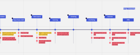
Miro User Journey
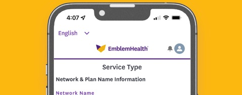
Native mobile app made with Salesforce's mobile publisher
Iterative Design - Strategy, Figma, Prototype, Test, Repeat
We designed modular, Lightning-compatible flows that worked within Salesforce’s design system and platform constraints.
-
For the provider portal, we broke the onboarding experience into simple, step-by-step screens with built-in logic, progress tracking, and helpful guidance to keep things moving.
-
For the member portal, we created a personalized dashboard where users could view their benefits, check claims, access care plans, and find support without getting lost.
-
For the agent console, we designed layouts that pulled together everything customer service agents needed: case history, care plans, and Einstein recommendations (so they could resolve issues without switching between tabs).
We tested every flow through hands-on sessions with stakeholders, providers, and customer service agents. The feedback helped us catch gaps early, tighten up the experience, and make sure the designs actually worked in the real world.
Measured Success
Once the core flows were live, we worked with the analytics team to define KPIs(Key Performance Indicators) that tied back to real outcomes, things like faster provider onboarding, quicker case resolution, and more people using the portals. We tracked performance through Salesforce dashboards and user behavior tools to make sure the redesign wasn’t just functional, but actually making a difference.
In the first 90 days, self-service actions on the provider portal doubled, and call center escalations dropped by 30%.
The platform wasn’t just modernized, it was measurably better. Now click here to see how we fixed the accessibility issues.
The core of my involvement.
Processes
- Discovery Workshops
- System & Journey Mapping
- Low-/High-Fidelity Prototyping
- Usability Testing
- User Centered Design
- Design System Integration
Tools
- Miro
- Figma
- Lightning Design System
- Salesforce Health Cloud
- Salesforce Experience Cloud
- Salesforce Service Cloud
- Figma Prototypes
- Google Forms